How to Incorporate Turquoise into Your Wedding Decor
Does turquoise count as your something blue? Absolutely! Check out Zola's lovely tips for incorporating turquoise wedding decorations into your special day.

Turquoise, Pantone’s 2010 color of the year, is a unique family of colors in the blue-green variety. It occurs naturally, both in the gemstone and in tropical ocean vistas. But, it also sports a rich history of use across many cultures, from ancient kings’ talismans to modern-day Tiffany boxes. As such, turquoise is a perfect color for your wedding.
In this guide, we’ll start by walking through a handful of turquoise wedding decoration themes to consider. Then, we’ll dive into some color schemes, as well as the science behind how to get the most out of turquoise—and any color you choose! Continue reading to get inspiration for your upcoming turquoise wedding.
Turquoise Wedding Decoration Themes
The color of turquoise, sitting perfectly between green and blue, evokes so many moods. And it’s not just envy and sadness, either. In brighter tints, it can evoke the joy and fun of neon. In darker shades, it can enhance subtle, solemn beauty.
Turquoise is more than the sum of its parts, especially when used in weddings.
One of the best ways to incorporate turquoise into your wedding colors is to consider themes that feature it:
Ocean-Inspired Decor
Think of the view from a sunny, tropical beach. The water’s clear when you’re swimming in it, but, from afar, it radiates those beautiful seafoam hues between blue and green, punctuated by whitecaps and the occasional rock—or swimmer.
A beach wedding doesn’t need to happen near a body of water to channel the sea.
Aquamarine hues such as turquoise are a great way to get the aesthetic of the ocean into just about any venue. Some ideas for executing this theme include:
-
Pair turquoise with other blues and greens for authenticity.
-
Make use of mirrors to surround guests in oceanic colors.
-
Consider contrasting pinks, oranges, and reds in the coral and salmon families.
A Winter Wonderland
On the other end of the weather spectrum, turquoise-like colors can also be used to create a dreamy winter wonderland setting for your wedding. For this, you’re looking for teal—a darker, less jubilant form of the blue-green mixture.
A winter-inspired wedding is a white wedding with a turquoise twist:
-
If white represents snow, teal is the backdrop that accentuates it.
-
Also, consider periwinkle (blueish grey) for snow and ice.
A snowflake’s pattern is beautiful only in contrast with its background, so why not turquoise?

(Not So) Hidden Gems
Turquoise the color gets its name from the mineral. It’s a naturally occurring gemstone, a true wonder of nature. Why not harness that natural power for your wedding celebration?
One of the best and most unique ways to feature turquoise is to feature the stone itself. Turquoise has been featured in jewelry since ancient times. In years past, its value was derived in part from its rarity: High-grade turquoise was hard to find, and lower-grade stones weren’t ideal for working with. But, nowadays, stabilization makes lower-grade turquoise just as useful for jewelry and other applications. And stabilized turquoise is much more affordable.
So, consider featuring turquoise stones throughout your wedding decor:
- In jewelry
- Through silverware place settings
- Showcased in embroidery
Turquoise stones can be a great way to incorporate the color into any overall theme you choose. But, beyond themes, another way to consider turquoise is in the color palette of your design.
Color Palettes Featuring Turquoise
When imagining and designing your wedding, the theme isn’t the only consideration. Colors have a significant impact on the entire look and feel of your celebration. The colors you pick won’t just impact how you and the whole wedding party look. They’ll also have effects on how every photo turns out and how appetizing the food looks on each plate.
A carefully planned wedding accounts for color in every decision regarding decor. A color scheme can even be a theme unto itself.
Let’s take a look at five turquoise-inspired palettes or schemes:
#1 Turquoise With Cinnabar Accents
A match made in mineral heaven.
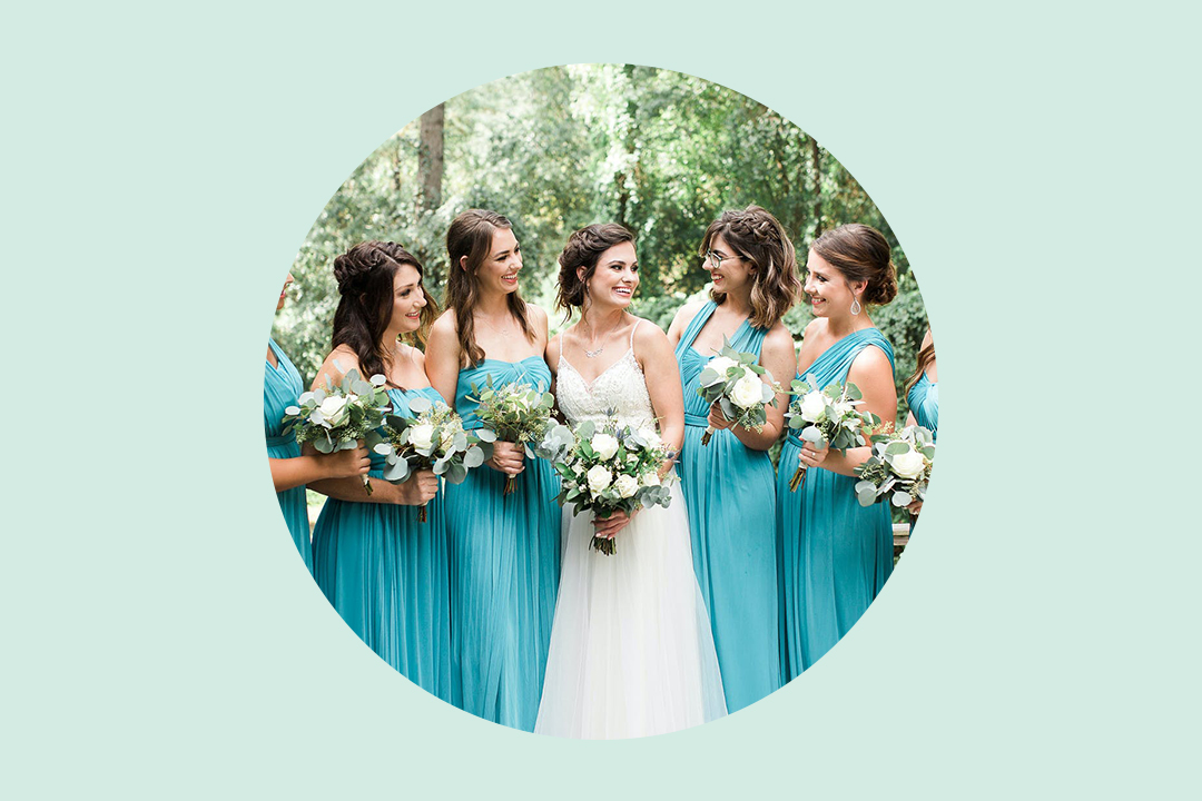
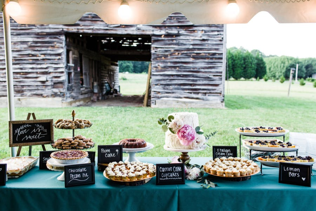
For this simple, high-contrast palette, the key to nailing it is making turquoise the star of the show. Attire and decorations can feature a base of turquoise. Try incorporating turquoise into your wedding cake, bridesmaid dress, or table centerpiece to showcase your favorite color to your guests. Then, select a neutral such as white for relief purposes. That’s what makes the red-orange accents pop without being too much.
Some ideas include:
- Bright turquoise and white backdrops, maybe in the ocean theme from above.
- Muted cinnabar for all lettering and graphic design on these backdrops.
#2 Turquoise Accented With Red and Orange
A slightly more complex step up, this palette depends on featuring one accent more than the other, or alternating the two accents. You can think of the one accent from the first inspiration scheme being broken down into two component parts. Turquoise is still your base, but the neutral appears less.
#3 Blue and Green With Turquoise Accents
In this case, turquoise stands out as the star in an accent role. Your base colors are blue and green, used in equal proportion. Turquoise cuts through both as an equalizing pop of color.
Consider these specifications:
- Light, tinted shades of blue and green for linens.
- An even lighter tint of turquoise for details such as ribbons.
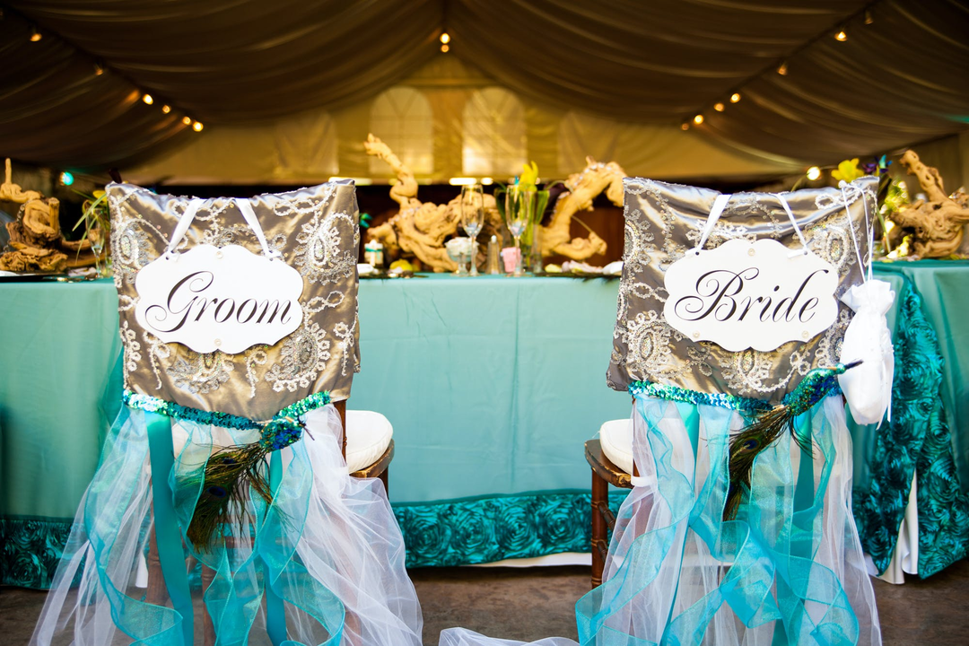
- Invert this and use turquoise as the base for select items, such as centerpieces.
Much like how you and your partner are two individuals, yet together you glow in a whole new way, the blue-green-turquoise combo will have guests enthralled.
#4 Turquoise, Wine, and Amber
These are three strong colors that mix well in a few different ways. You may want to have one be the base, with the other two acting as accents. Or, you could use two prominently, with one acting as the accent between them.
One way to make the most of it involves:
- Turquoise base for all textiles.
- Amber for a secondary color, including silverware.
- Wine as the true accent, such as text and design elements.
#5 Turquoise, Lime Green, Burnt Sienna, and Burgundy
This is a bold, elaborate combination of four colors.
One way to make it work is to lean all the way into one of the colors (why not turquoise?) and let the others take a back seat.
Some ideas for this first method include:
- Turquoise as the base for linens.
- Sets of individual accents in each other color.
Another way to rock this palette is to foreground a neutral and use the four colors as accents:
-
White or grayscale backdrops accentuated by themes that work with each other:
- Turquoise and lime
- Burnt sienna and burgundy
-
Or, neutral backdrops with two themes that have internal contrast:
- Turquoise and burnt sienna
- Lime and burgundy
From simple to intricate, what makes these palettes work so well? Color theory.
Color Theory Is Your Best Friend
Color theory is the scientific study of color. It explores what individual colors are and how they relate to one another. It also offers several ways to think about pairing colors, and how. In addition to the examples above, understanding how color theory works is the best way to create your own palettes with turquoise.
The color wheel is the most essential part of color theory.
The Color Wheel
The color wheel is a way that artists have thought about color for hundreds of years. Unlike the visible light spectrum in a rainbow, there are 12 main hues identified in the wheel, with no clear beginning or end. Clockwise from red, the color wheel comprises:
- Red
- Red-violet
- Violet
- Blue-violet
- Blue
- Blue-green
- Green
- Yellow-green
- Yellow
- Yellow-orange
- Orange
- Red-orange
The wheel can also be divided into two halves:
-
Warm hues:
- Red
- Red-orange
- Orange
- Yellow-orange
- Yellow
- Yellow-green
-
Cool hues:
- Green
- Blue-green
- Blue
- Blue-violet
- Violet
- Red-violet
For a low-contrast palette, warm colors pair well with other warms, and colds with colds. Conversely, you can create contrast by pairing a warm with a cold.
Plus, there are tints, shades, and tones to consider:
- A tint is a lighter form of a hue with white added.
- A shade is a darker form of the hue with black added.
- A tone is a form of the hue with grey added.
What Makes Combinations Work
The most useful element of the color wheel is the way it makes schemes easy to imagine. This allows the bride and groom to see which colors work best with each other to make sure that their wedding reception and ceremony are perfectly decorated.
When putting together a palette, all you need to do is consider certain relationships on the wheel, such as distances between colors. For example, some of the easiest ways to build a scheme involve these relationships:
-
Triadic – Like palette number four listed above, a triadic relationship involves three colors equidistant from each other on the wheel. For turquoise, that means a pairing with yellow-orange and red violet. These are high-contrast combinations where featuring one color helps mute them.
-
Complementary – The most basic way of color scheming. This is a pair of two colors exactly opposite on the wheel, like in palette number one listed above. This produces the highest contrast of all, since the colors are pure opposites.
-
Split complementary – Embodied in palette number two listed above, this kind of pairing takes one color’s complement and substitutes it out for the two hues adjacent to it. For turquoise, that means replacing the complement of red-orange with red and orange.
-
Double complementary – Also known as tetradic, this is the most complex kind of scheme, typified by palette number five listed above. It pairs two sets of complements together for a total of four colors. The pairs can be mixed and matched, especially if one color in each respective pair is analogous to another color in the whole group. Which brings us to...
-
Analogous – Arguably the simplest kind of scheme, like palette number three listed above, this involves using colors that are adjacent to each other. Any three consecutive colors are analogous. However, you often want to avoid mixing warm and cool colors in this kind of scheme.
With these relationships in mind, you can use turquoise in many different combinations. From simple complementary pairs to
Turquoise: Your Key to a Colorful Celebration
Between all the themes and palettes detailed above, it’s clear that turquoise is a great color to consider for your wedding decor. Plus, with an understanding of color theory, you’re well prepared to create your own scheme featuring turquoise—and any other colors you choose. Once you've decided on this gem of a color, browse turquoise and teal wedding invitations to set the tone for your wedding day.

Zola: Your Key to a Wonderful Wedding
If you’re ready to go forth and create your dream celebration, there’s no better starting place than Zola. Here, you can easily create a free wedding website, set up invites, plan your registry, and use all the other wedding planning tools at your convenience.
Your wedding deserves to be as beautiful as it is stress-free. Zola can help with both.
