- Expert advice/
- Wedding planning 101/
- Wedding websites/
- A-Z List of What to Put on Your Wedding Website
- Wedding websites
A-Z List of What to Put on Your Wedding Website
Check out our comprehensive, A-Z list covering everything you should add to your wedding website so you don't forget any important details.
Last updated February 5, 2024

Once you’ve chosen your ideal wedding website design, start adding in all of your ceremony details and events surrounding your big day. We’ve put together an A-Z list to help you decide what to put on your wedding website so that nothing gets missed along the way.
A - Accommodations
Under the Travel section of your website include recommended accommodations for your wedding guests. Make sure to include the promo code and supplemental information for the hotel where you’ve reserved rooms. Add one or two alternative suggestions that are close to the venue as well. Make it inclusive for all by giving recommendations that span across different budgets.
B - Bridesmaids
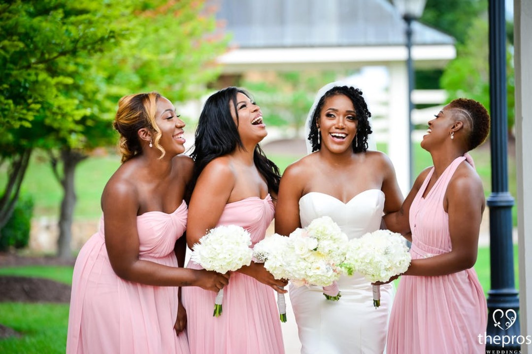
Let guests get to know part of your bridal party by adding bridesmaids bios to the website.Wedding party bios can be kept short and sweet, no lengthy details required. Share how you know each person and if there is a special connection to you as a couple. These are always fun for people to read.Feel free to add in humor and keep things lighthearted when you’re writing them.

C - Couple’s Story
The story of how you and your partner met is one that everyone wants to know or hear again. Take guests through where it happened, how you felt when you first met, and what created the spark that started your relationship. Let romance take the reins with a retelling of where your journey together began. Adding your wedding story to your website is a great way for your guests to learn more about both the bride and groom.
D - Directions
Use the map feature to help your guest navigate to the ceremony, reception, and hotel accommodations.You may also want to include notes about landmarks or signage that will let people know they’re in the right place. Add approximate time between places as a helpful detail as well.
E - Events
The Events section of your website is where you can list details about the ceremony and reception. Additionally, if you’re hosting other wedding events during the week, add the time, date, and location to this area. This may include a cocktail hour the evening before or a friends-and-family brunch the morning after. Fill in this section as plans are confirmed.
F - FAQs
Your wedding website will help answer all of the frequently asked questions people have about your upcoming nuptials. General questions often include whether plus ones or children or allowed. You can also include any of the questions you’ve fielded regarding proper dress attire. Use this space to allow guests to get their questions answered all in one place.
G - Groomsmen
When it’s time to write bios, don’t forget to include the groom’s side, too. Add in a sentence or two about each of your groomsmen as a way to introduce them to your guests. A unique addition is to offer an icebreaker question that will encourage guests to mingle with them at the reception. For example, if one of your groomsmen is a baseball fan, the prompt could be: What is your favorite baseball stadium and why?
H - Honeymoon Funds
The registry feature allows you to add a cash fund for your honeymoon, new home, a favorite charity, or something else personal to you as a couple. Guests want a way to contribute to your new life together, and what better way to start than with your honeymoon? It makes it extra special for them knowing they’ve given you a gift to celebrate your marriage in a unique way.
I - Insider Information
As part of the Things to Do section, give guests insider information to your favorite places, restaurants, and activities. Let them know what are the must-trys and your personalized recommendations. This will help them feel as if they know more about your life as a couple and will help them appreciate your city as much as you do.
J - Jokes
Although the main purpose of your wedding website is to share pertinent information, it should also be enjoyable to read. Feel free to add a few jokes or funny moments to your couple story or wedding party bios. It makes it feel inviting to everyone as you start to connect both sides of your guest list together leading up to the wedding celebration.
K - Kids
Some weddings have a strict no-kids policy. Sometimes couples allow children at the reception but not the ceremony. Then again, there are weddings where the more, the merrier and everyone of all ages are invited. Make it clear on your website if kids are invited.
L - Location
Add where the wedding will be taking place. The main page of your website will read similarly to the wedding invite itself. It should include the date, time, and the location of your ceremony. This allows guests to make proper travel arrangements in advance and have an idea of when and how they should start planning their trip.

M - Maps
It’s easy to add maps to the various sections of the website, which makes it accessible for those who are getting the information on their phones. It’ll automatically link up to their chosen map app to get them where they need to go without too much hassle.
N - Numbers
Add phone numbers to the hotels and other places where guests may need to call to make reservations, inquire about room availability, or request special accommodations. Having this information stored in one place with the addresses and map details helps to make everything streamlined.
O - Order
Following a wedding design template allows you to create order to the flow of your information. Edit, remove, or hide the different sections as you see fit. The goal is to make it as easy to understand and informative as possible for your guests.
P - Photos
A good way to share your love story is through photos. Add as many photos as you want to depict your relationship, including engagement photos and images of family and friends who will be present at your wedding. They say a picture is worth a thousand words, which means you can say a lot by adding a few for guests to scroll through and enjoy.
Q - Questions
In addition to answering FAQs, you can also add questions to your RSVP section about meal selections and how many guests are attending. Guests can fill out an RSVP for themselves or for their whole party. By having this option available online, it can encourage guests to complete this important step sooner rather than later.
R - Registry
One of the main questions guests will ask once they know you’re getting married is where you are registered. Fortunately, by creating a wedding website through Zola, you can easily add a wedding registry where guests can shop directly. You can add gifts from the Zola store and items from other websites, too.
This way you can have all of your registries in one place. This makes it easier for guests to see what’s available. Plus, it makes it easier for you to set up shipping and thank you notes for gifts received. Win, win for everyone.
S - Schedule
Guests can reference the Schedule section of the website for information about when ceremony begins and when other events are taking place and where they need to be. With each section, there is room to insert a detail or two to let guests know what to expect. For example, if you’re hosting a cocktail hour, let guests know if appetizers will be available.
T - Things to Do
For guests who are traveling from out of town, the Things to Do section will guide them to some of your city’s main attractions. When deciding what to put on your destination wedding website, include some of your favorite spots and general proximity to the wedding venue. You won’t have time to play tour guide leading up to your wedding day, but you can provide resources and recommendations for friends and family in advance.
U - Unusual Requests
Depending on the destination or other details of your wedding, there may be a few unusual requests that you’d like to relay to your guests as they make plans for your wedding.
For example, you may not want anyone to have their phones with them during the ceremony. Many couples ask this of their guest to help them remain in the moment and to give their wedding photographer ample opportunity to get the professional shots without inadvertently being blocked.
V - Vision
The vision for your wedding website isn’t something you have to write out in detail. Guests will get a good idea of this by the design you choose. There are hundreds of Zola wedding website templates to choose from that reflect all kinds of personalities, styles, and tastes. Play around with different options before settling on the one that best speaks to you.
W - Welcome Message
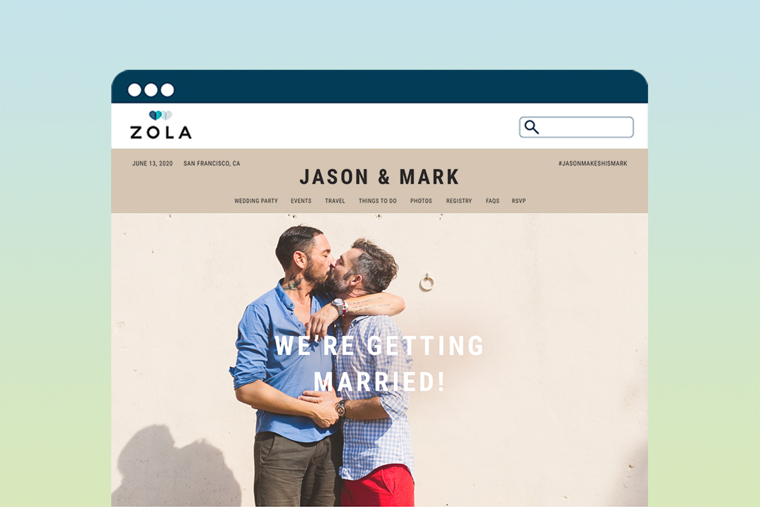
Part of creating your wedding website will include writing a welcome message that invites people to check it out. Start with a tagline such as “We’re getting married!” followed by a greeting to your friends and family. Add a few lines to let them know what they can expect to find on your website and encourage them to RSVP as soon as possible. Sign off with a sentiment about how excited you are to celebrate with everyone.
X - E(x)citement
On that note, set a tone of excitement with every detail you share about your wedding day. While some of the information is purely logistical, write it in a way that makes people feel happy to read it. No one is likely more ready for your nuptials than you, but your guests will get some of those same feelings, too, if you convey it by being thoughtful with your words.

Y - You
As you decide what to put on your wedding website, remember that it should reflect you as a couple. From the design to the details, guests should immediately feel as if they’ve arrived at the right place. Find ways to add in words, photos, and information that feels distinct to your relationship and personality as a couple.
Z - Zola
Add links to your Zola registry for your guests. You can also hide certain sections from public view, such as pages you’re using to store links and information while you plan. Allow your website to serve as a resource for your wedding planning and a guide for guests as they prepare for your big day.
- Expert advice/
- Wedding planning 101/
- Wedding websites/
- A-Z List of What to Put on Your Wedding Website
Find even more wedding ideas, inspo, tips, and tricks
We’ve got wedding planning advice on everything from save the dates to wedding cakes.

