- Expert advice/
- Wedding planning 101/
- Wedding websites/
- How To Create a Wedding Website: A Complete Guide
- Wedding websites
How To Create a Wedding Website: A Complete Guide
Create a personalized wedding website with our step-by-step guide. Learn how to craft a digital space that shares your love story and wedding details.
Last updated February 5, 2024
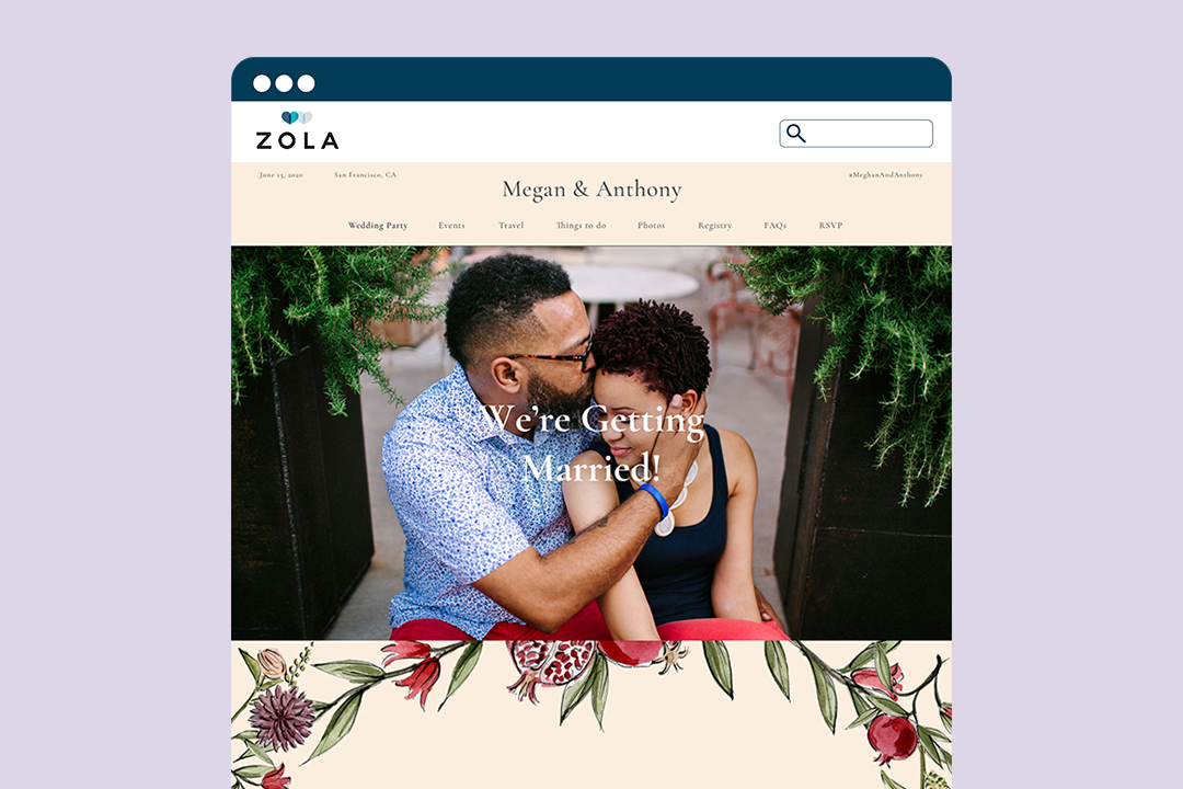
The First Look ✨
- Zola makes it easy for couples to personalize their wedding website in these eight ways.
- Make your website your own by including a template, aesthetic elements, and photographs that represent your style and relationship.
- Get personal by sharing your relationship story, mini bios of the wedding party, and showcasing your personalities (e.g. humor) through text.
Creating a wedding website is one of the most important—and fun—steps in the wedding planning process. It’s the central hub that your guests will keep visiting to stay informed and excited about the big day. While it’s easy enough to select a wedding website template and type up the necessary info, the best wedding websites are those that feel personal to the engaged couple and have all the functionality you want. Luckily, Zola makes it easy for couples to add personal touches to their wedding websites. Read on for our eight favorite ways to make your site your own.
- Part 1: The Look
- Part 2: The Text
- Part 3: Building Your Wedding Website With Zola
Part 1: The Look
Every engaged couple has their own unique idea of how they want their wedding to look and feel. Just like your wedding’s color palette or theme, your wedding website is an opportunity to visually express your interests or who you are as a couple. Consider your website not only an information base, but a way to set the tone for your wedding date. Color palettes, fonts, photographs, and other visual elements are simple yet impactful ways to customize each page. What’s more, it’s super easy to do with Zola, and you’ll see how as soon as you sign up for an account.
Decide on an Overall Aesthetic
Before jumping into website design mode, consider the overall aesthetic you want your website to have. Likely, this will mirror your wedding theme or color palette, though that doesn’t have to be the case. Your wedding website’s appearance can be based on a theme, your wedding location, the time of year, cultural influences, or any other mood or detail. Whatever lends itself to how you want your guests to experience receiving all your wedding information.
If you want to keep things cohesive and have already designed your wedding paper suite, that can be a largely helpful starting point. Whatever you choose, note the colors, shapes, and overall feeling you get when looking at your source of inspiration. Keep these things in mind—or jot them down—as you start to create your website and they will come in handy as you work through the process.
Choose a Template That Compliments Your Vision
One of the many upsides to making your wedding website on Zola is the number of pre-made and highly customizable wedding website templates available. From clean minimalism, to rustic, to a variety of other themes, there’s something for everyone—even if it’s just a jumping-off point. Although the designs are beautiful as they are, what’s even better is the level of customization. With easy-to-navigate tools, you can upload photographs (more on that below), edit several different pages, and even see samples for inspiration. It truly is a very easy process.
Incorporate Photographs
The easiest way to create a unique and completely personal wedding website is by incorporating photos of you and your special other. A photograph—be it from your engagement session, proposal, or earlier in your relationship—can quickly give guests a feel for your relationship and upcoming wedding. Look for pictures that communicate who you are as a couple, as well as shots you just find utterly beautiful. Your guests will be thrilled to be greeted by your faces.
Note that we’re not describing a photo gallery. Your engagement photos may be beautiful and older photos a fun inclusion, but too many pictures can be overwhelming and difficult to navigate. Strategically place your favorite photos in the appropriate places, such as an engagement photo as your banner image and a few older snapshots alongside a relationship timeline or “How We Met” love story. Your guests will love reading those pages and getting to know you both as a couple before attending your wedding.
Part 2: The Text
While the first thing someone will notice is how your website looks, they’ll spend the most time reading what’s been posted to it. Its purpose is to inform, after all. However, that doesn’t mean all your information needs to be crucial or formally written—although you can totally go in that direction, too. Logistics, schedules, and other important wedding details such as the rehearsal dinner and wedding registry are necessary, but consider including other, more personal (but relevant) sections as well. These extras bring life to your wedding site and will be fun for your guests to read. This is especially true for those you haven’t met yet or those who don’t yet know you as a couple. Add some fun personal facts such as where you first met or how you felt about each other before you began dating.
Set a Custom URL
Something easily overlooked that can make all the difference on detail cards, wedding invitations, or online is your URL. Setting a custom domain is a simple way to further personalize your website. Plus, it makes it look more official. To set a custom URL on a Zola free wedding website, simply click “Website” from the Zola homepage and scroll down until you see “Your Unique URL” on the left-hand side. Click “Edit URL,” fill in the provided space, and click “Save.” Remember to be concise and careful with spelling. Once saved, you’ll be notified with a brief green pop-up. If you ever want to change it, navigate back to the box, and click “Edit URL” again. Just be decided before you begin sharing.
-
Not sure what to set your URL as? Take inspiration from one of the below.
-
You and your special other’s first names: johnplusjames, allieandamy, sarawedsrosa, joshandellie2022
-
Your last names: thegarcias, howeiloveyou
-
A play on the proposal: robsaidyes
-
Your wedding location: sanneandmaxinjapan
Write a Welcome Message
Aside from any banner images, this will be the first thing your wedding guests see. Welcome everyone on your guest list to your website with an initial greeting headline (like “We’re Getting Married!” or “Celebrating Our Union”), followed by an introduction to your celebration or what to expect on your wedding website. This shouldn’t be lengthy since guests will be able to get in-depth information elsewhere on the site. Keep it brief and keep it sounding like you. Some wording examples are as follows.
- Welcome, loved ones! We’re thrilled to celebrate our love and the next chapter of our lives with you.
- Hello, family and friends! We can’t wait to celebrate our wedding with you. You can find all the exciting details throughout this site.
- Welcome to our wedding website! Watch this space, because we’ll be sharing everything you need to know about our wedding day right here.
Share a Few Stories
Welcome your guests to your website with one or more heartwarming stories about your relationship. These serve as wonderful additions to your homepage or spotlight on an “About Us” page of their own.
-
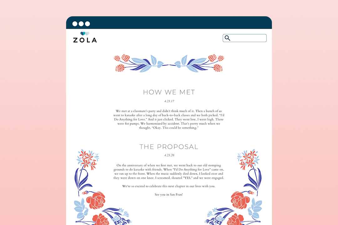
Your “How We Met” Story: Recount a short and sweet story of how you both met and began your relationship.
-
Your Proposal Story: Tell your guests how the proposal went down (bonus points if you have photos or videos to share).
-
Your Relationship Story: Bundle the above and a few other important moments into a brief overview of your relationship.
-
Your Relationship Timeline: Briefly note any major milestones you’ve experienced together (big moves, your first pet, meeting each other’s families, your children, etc.)
Introduce Your Wedding Party
It’s inevitable—not everyone at your wedding will know each other. Moreover, not everyone will know every member of the wedding party. These can be prominent people in your ceremony and reception. Help your guests get to know everyone by dedicating a page to the wedding party, complete with names, photographs, and mini bios. Include each person’s role (Maid of Honor, bridesmaid, groomsman, etc.), how they know the bride or groom, and any quick details you’d like to add. Fun facts or their well-wishes to the couple work perfectly here, depending on the mood you want to set.
Showcase Your Personalities
While it’s important that the information on your wedding website is clear and concise, it’s equally important that your website reads like you. Don’t force an overly formal tone if that isn’t representative of who you are as a couple. Likewise, don’t feel the need to gush if that isn’t your style. The goal is to strike a good balance between to-the-point and fun and familiar. Don’t be afraid to add jokes, quotes, and anecdotes where you can. Just make sure that, (1) it sounds like you, (2) information is easy to find and understand. Pro tip: While jokes are welcome, avoid a lot of sarcasm, which can be difficult to get a read on.
Part 3: Create Your Own Wedding Website Using Zola
You can create a beautiful wedding website for free by using Zola. Choose from a variety of templates and wedding website builder options based on your wedding theme and style. Choose from available color combinations and voila! Your website is ready for you to fill in all the details and share with your family and friends. You can find something formal and elegant or casual and chic—there are a few different permutations and combinations to play with before you settle on your final website design. Spend some time here working with the different options when it comes to theme and color—you might just have a tough time settling on one you like the most.
__Beautiful Wedding Templates to Take Inspiration From __ https://www.zola.com/wedding-planning/website/design/sona-pink
For an elegant option in pink, this exquisitely designed template with yellow patterns immediately calls your attention to a joyous occasion. The traditional motifs signal a different culture and gives guests an idea of the style of celebrations they can expect even before they begin reading the finer details of the different events entailed.
https://www.zola.com/wedding-planning/website/design/hopewell-blue
Perfect for a winter wedding is this gray-blue toned invite with designs in white to aptly express the season and the reason for a momentous event. The subtle colors and stylish fonts speak for the elegant and cozy event in store. This is great for a more formal or intimate affair with close family and friends.
https://www.zola.com/wedding-planning/website/design/bonnie-yellow
For a rustic vibe, consider this yellow tinted invitation with a happy sunflower to signal the blooming of a new union and many fond memories in the making. Perfect for an outdoor wedding or maybe a farm or barn setting that lends to the rustic theme. This is a great invite for a daytime or Sunday brunch-style affair.
https://www.zola.com/wedding-planning/website/design/oahu-navy
Wedding at the beach? This black and white invite is a classic twist on the typical blue and brown beachy design, with seashells, starfish and flowers decorating the page. It gives all the seaside vibes minus too much drama—A sophisticated design for a stylish couple. Try out other colors though if that suits your wedding theme better.
https://www.zola.com/wedding-planning/website/design/cruise
This tropical leaf patterned invite is all sophistication with its clean and simple design and fonts. Your guests know right away the wedding will be a classy affair. Mission accomplished just as intended!
Up next for you

Wedding Website URL Ideas
Inspiration
Wedding websites are the preferred way for couples to organize and distribute information for their big day. Need some wedding website URL ideas?
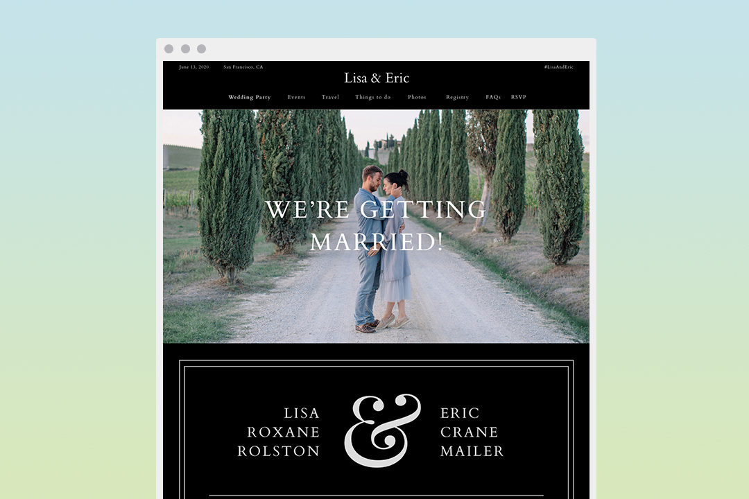
24 Wedding Website Examples: Themes and Designs
How-To
Need some wedding website inspiration? We’ve compiled a list of our favorite wedding website templates. Read more here.
Wedding Website Bio/Couple Story Templates
How-To
Our top tips to writing a wedding website bio to remember.
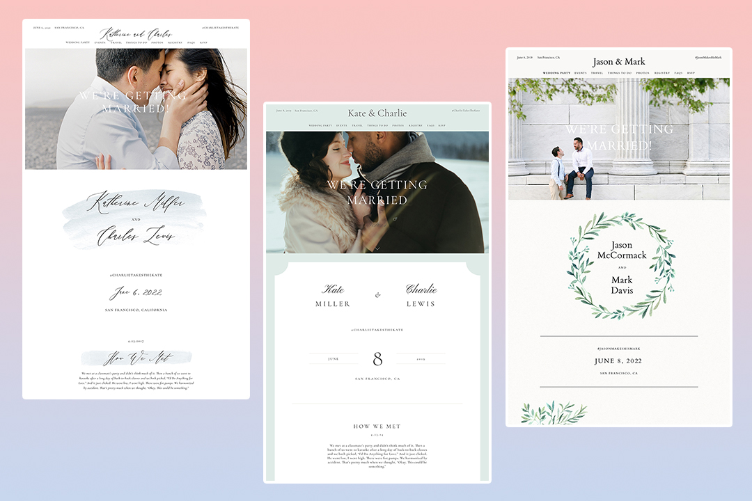
20 Free Wedding Website Templates That Will Inspire You
List
We count down our 20 most popular wedding website templates.
Featured

20 Free Wedding Website Templates That Will Inspire You
List
We count down our 20 most popular wedding website templates.
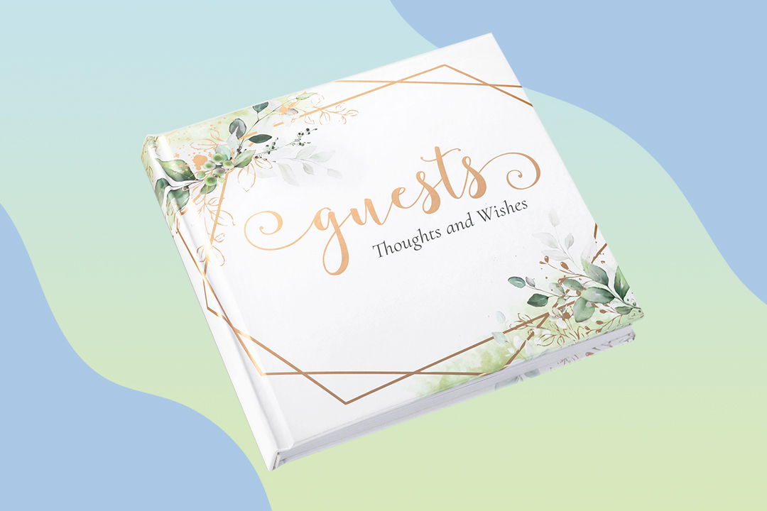
Do You Need a Wedding Guest Book?
Advice
Guest books are traditionally part of every wedding. But through your planning, you may wonder if you really need one? Read on to get this answer and more.

Wedding Invitation Postage: How to Mail Your Invites
How To
Your wedding invitations are ready to ship! Here's how to mail your wedding invites and save the dates with the right postage.

5 Lovely Wedding Website Bio Examples
Inspiration
Let your guests get to know your bridal party by sharing their bios on your wedding website. Read on for examples, tips, and ideas to help you get started!
- Expert advice/
- Wedding planning 101/
- Wedding websites/
- How To Create a Wedding Website: A Complete Guide
Find even more wedding ideas, inspo, tips, and tricks
We’ve got wedding planning advice on everything from save the dates to wedding cakes.
