FAQs
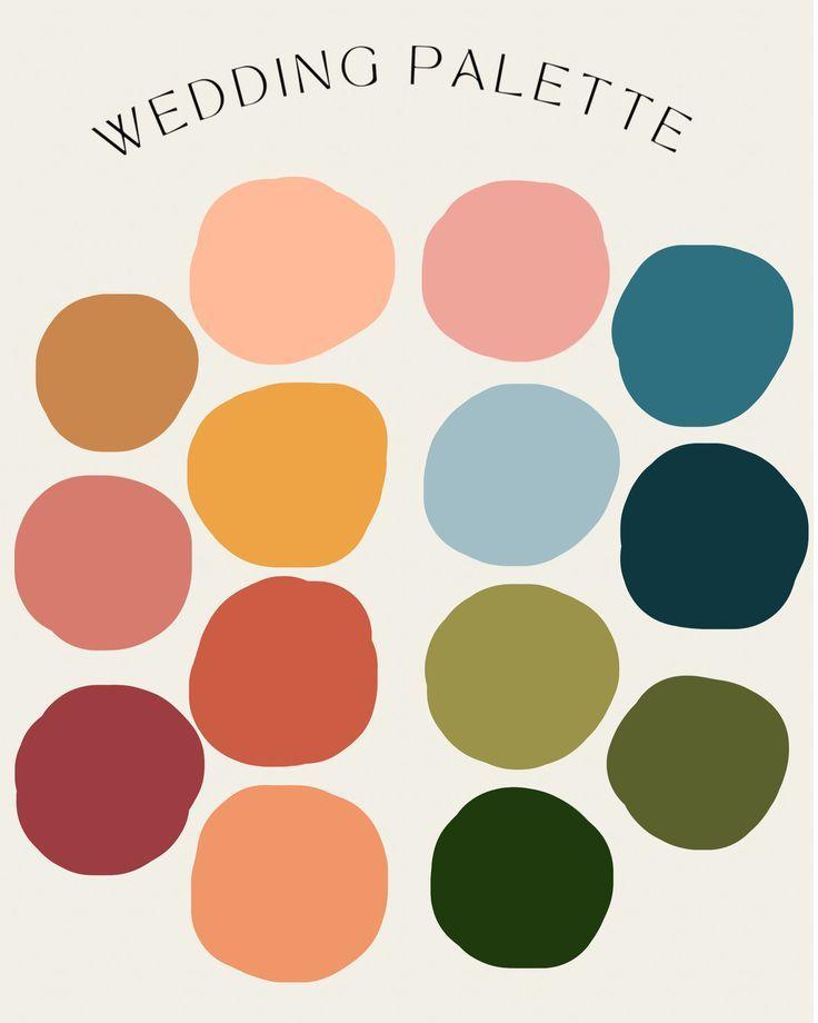
Attire & Color Palette
FUNKY FORMAL
As noted in the schedule, we kindly ask guests to avoid wearing black. Instead, please use the color palette above as your guide when choosing your outfit.
We encourage rich colors, soft tones, and fun textures! Anything that fits within the palette and feels like you. Thank you for helping us create a beautiful, cohesive look for the day!
Question
Examples
Answer
It can be lighter, deeper, or darker than the colors in the color wheel: Rust / burnt sienna (deepens your terracotta range) Marigold / deep mustard (a richer yellow) Clay / cinnamon (warm earthy neutrals) Dusty rose / antique pink (soft romantic tones) Deep berry (muted red-purple) Slate blue / steel blue (a slightly deeper version of the blue) Warm taupe/sand (neutral option that still feels intentional) Chartreuse muted/ olive (not neon - think more “golden green” than bright lime) Purple (Works if it’s toned down - dusty mauve, plum, or wine, not bright violet)
For all the days along the way